The challenge
Dew Gibbons (now Free the Birds) were renowned for designing exquisite packaging, particularly high end cosmetics. However, there was a commercial acumen to it, driven by thorough analysis and market knowledge. It was far from, well… cosmetic. It was this they wanted to capture. I was asked to look at the possibility of an ‘essence’ or strapline.
What we did
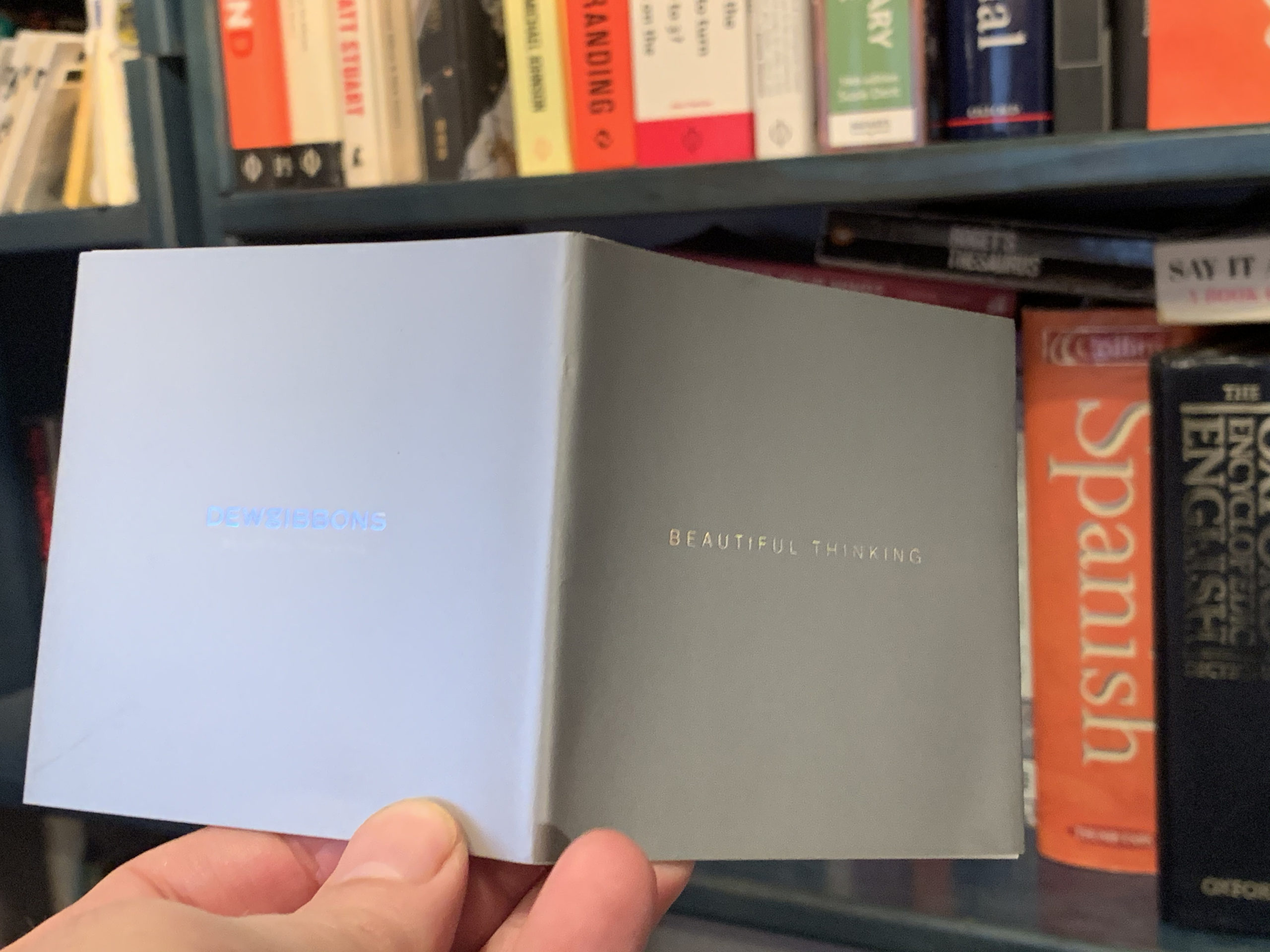
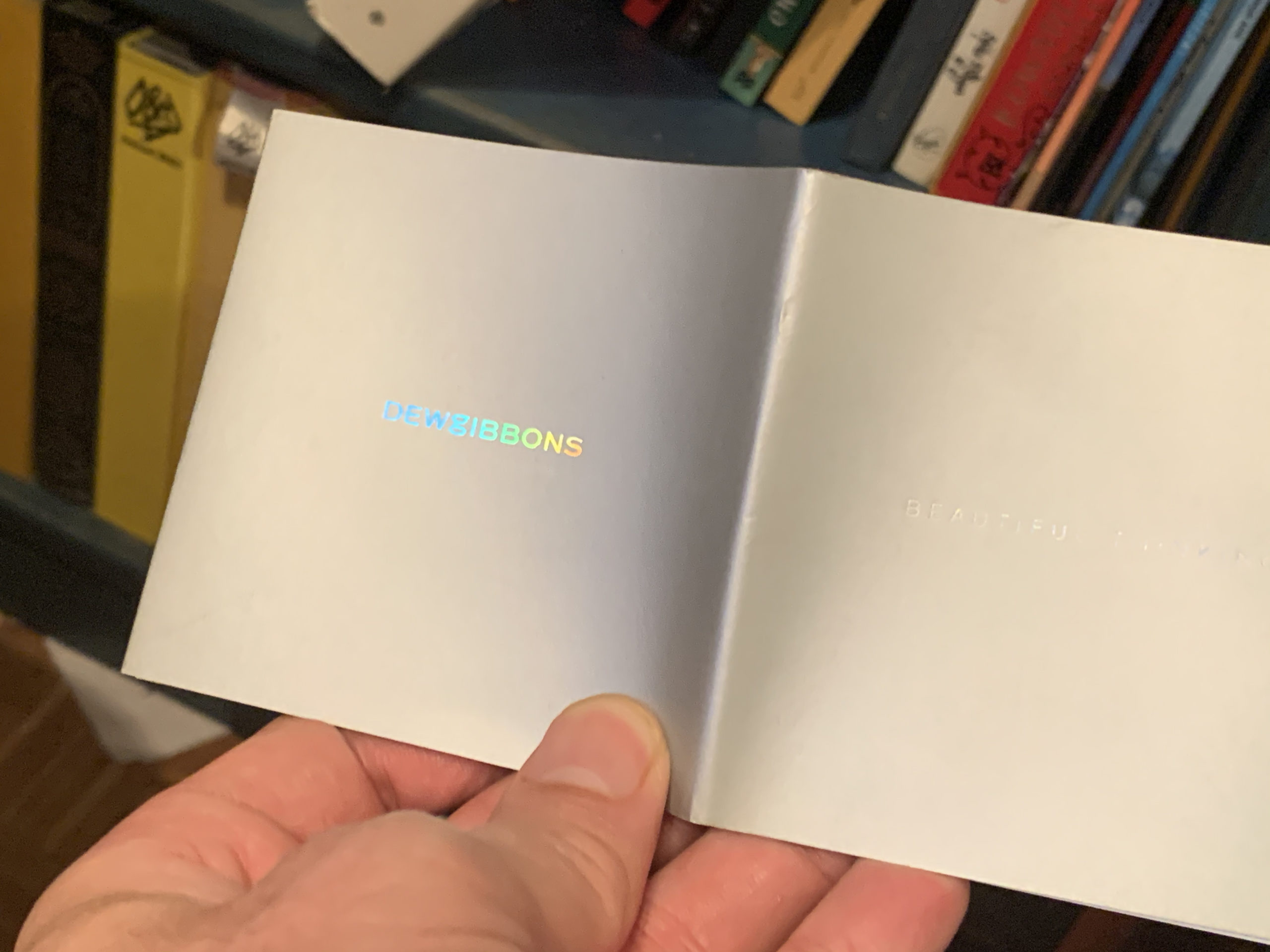
“Beautiful thinking” captured the balance between aesthetics and commercial acumen, but still felt simple and clean.
What happened next
The line has lasted over 15 years and is still going strong. In fact it’s formed the centrepiece of the brand strategy of those leading the design company now that neither Dew or Gibbons remain, since it underpins their growth into new areas.
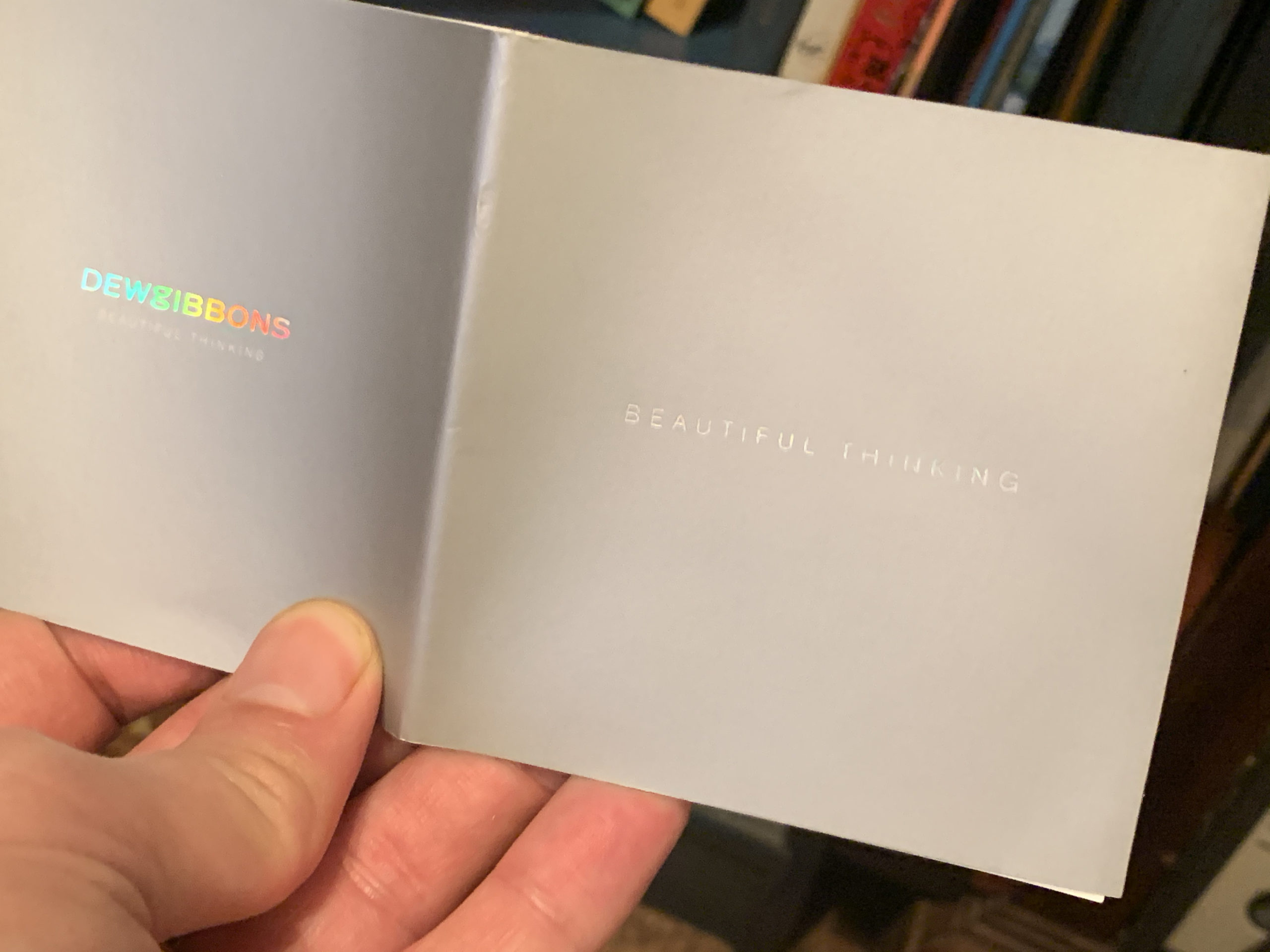
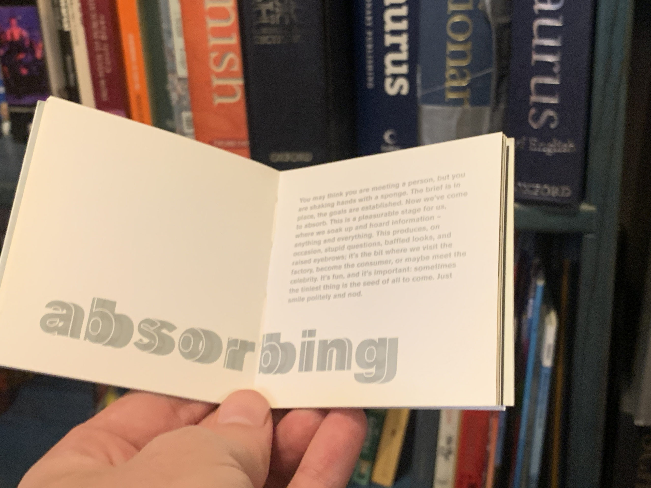
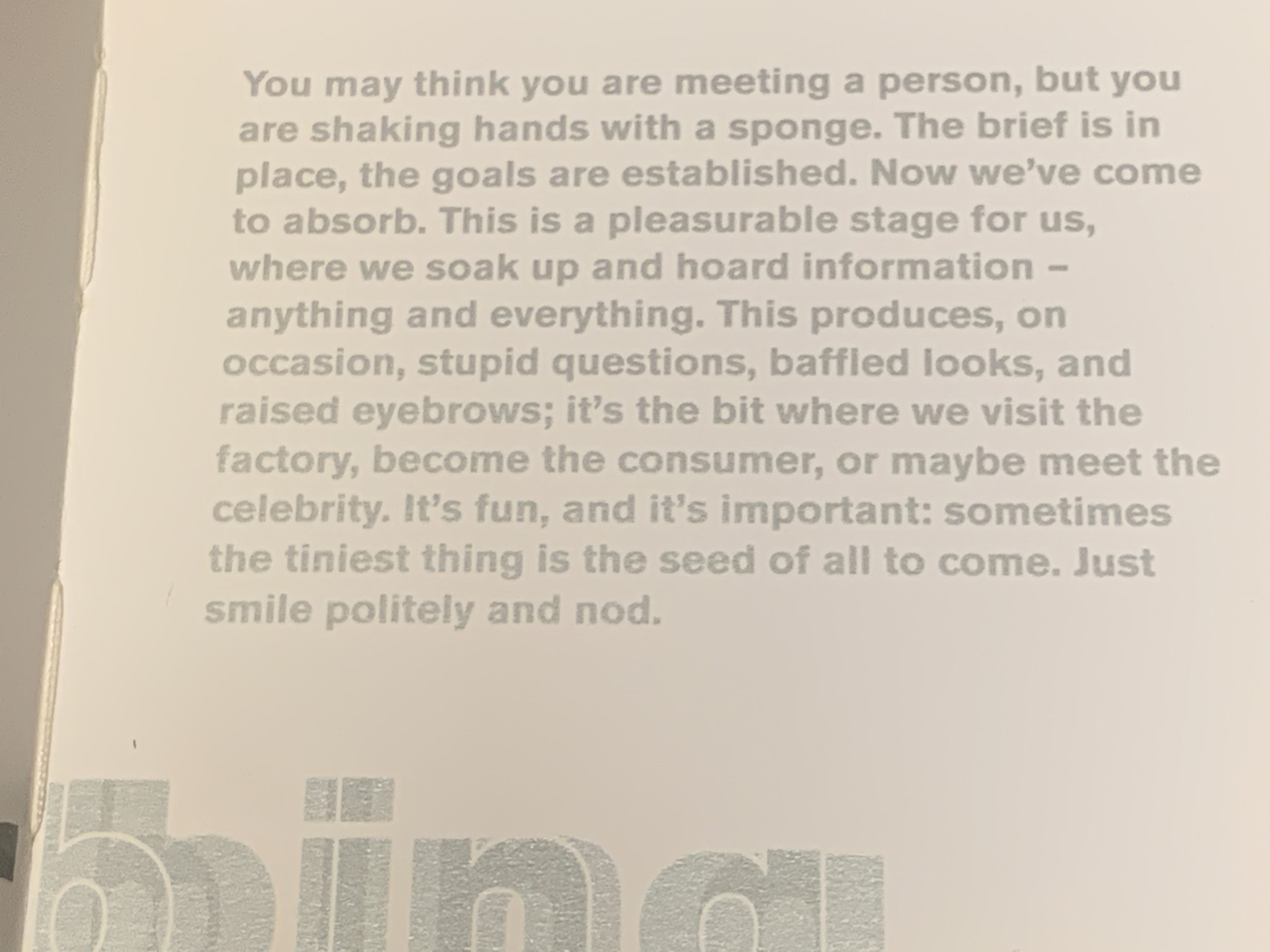
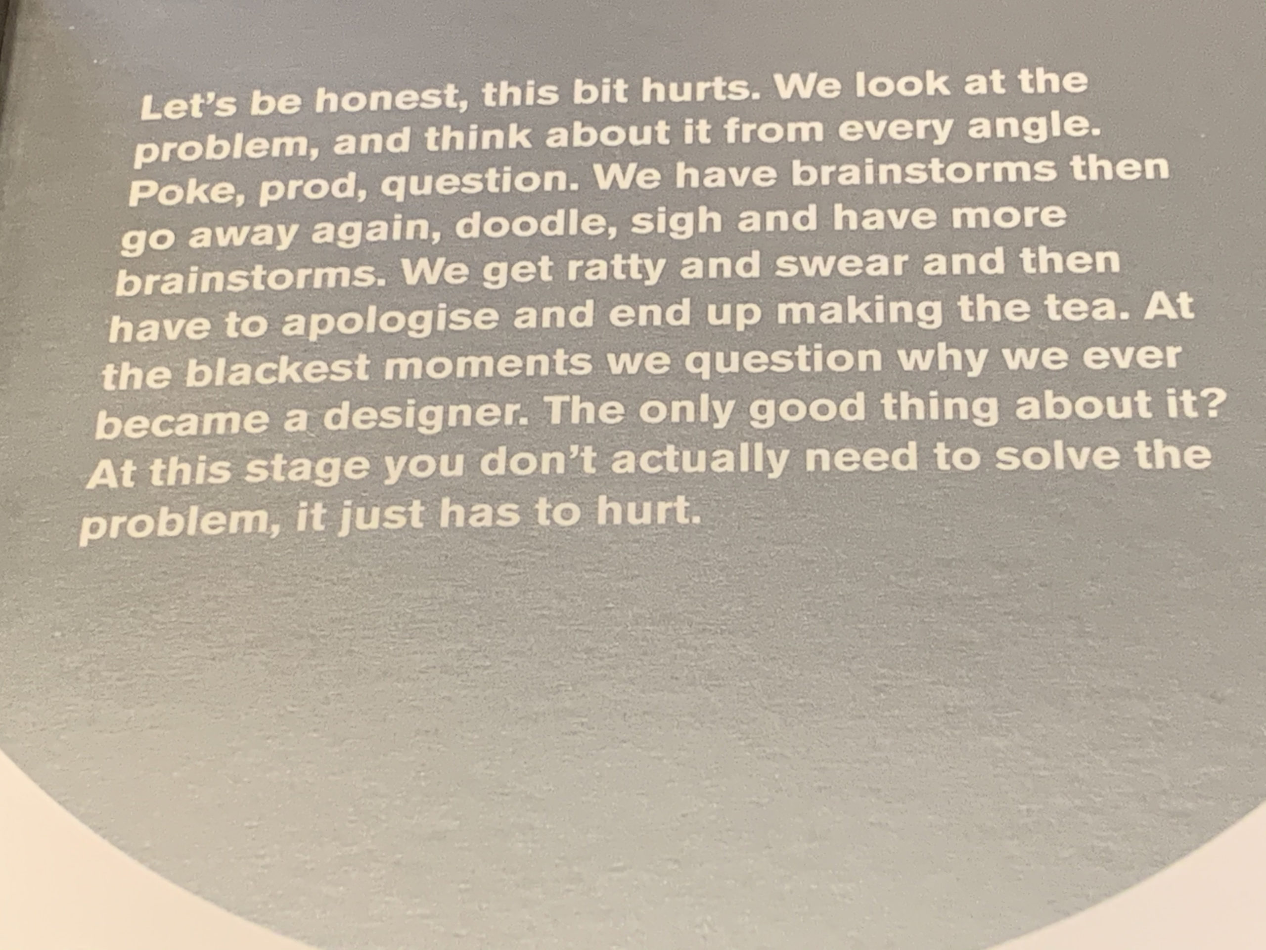
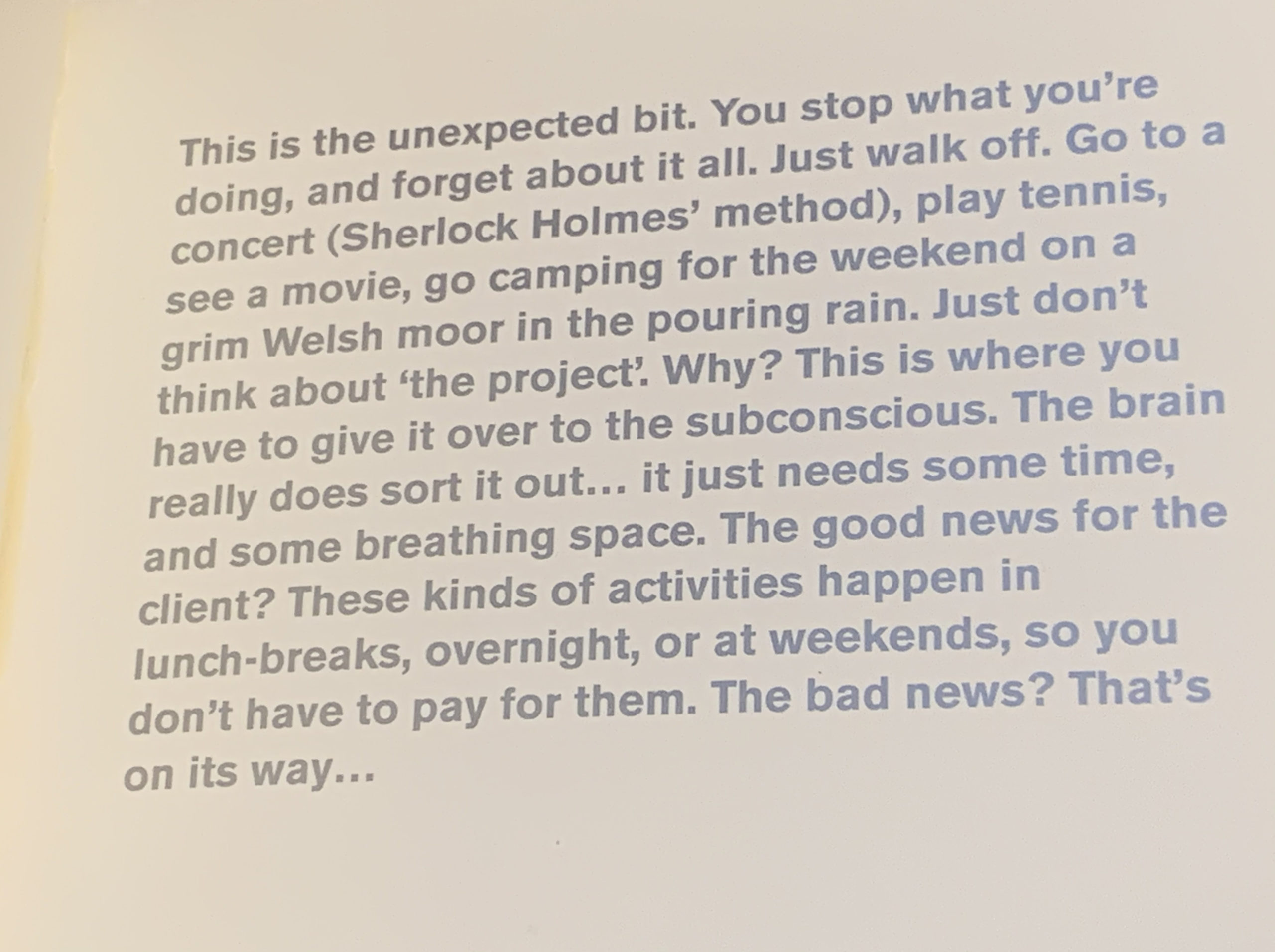
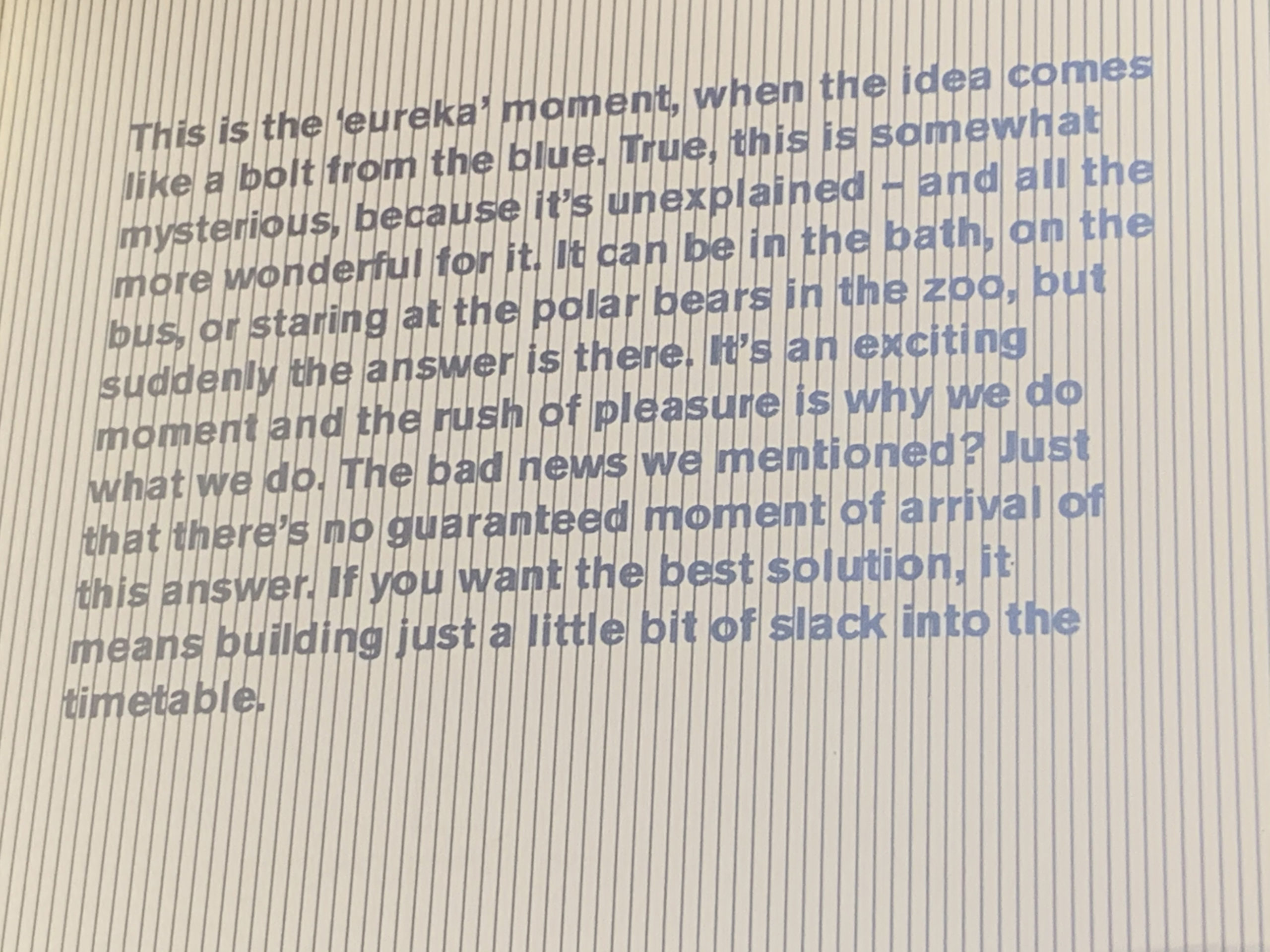
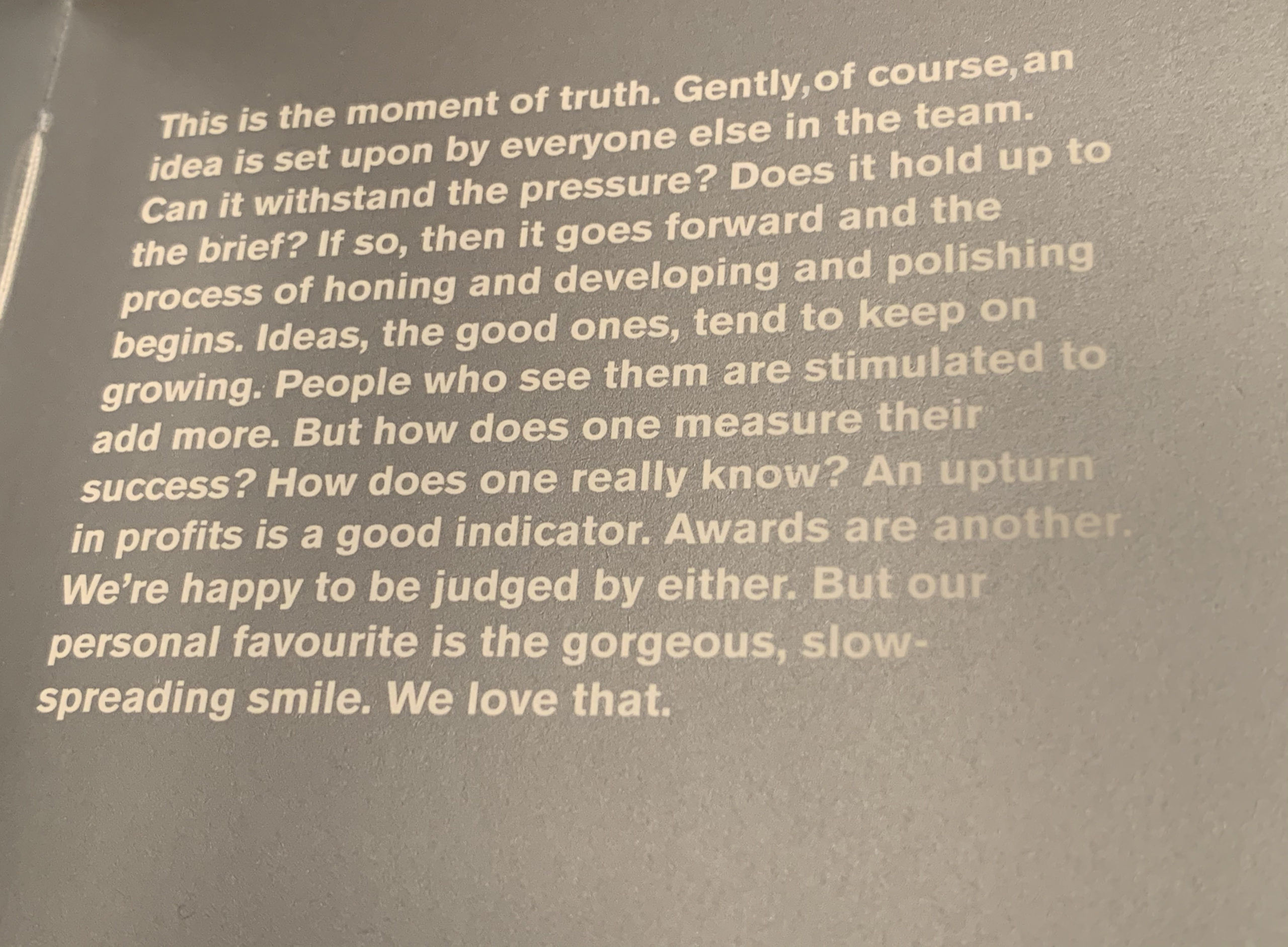
On the back of this we produced a little booklet on the creative process. Read more about the strategy behind this case study here.

