The challenge
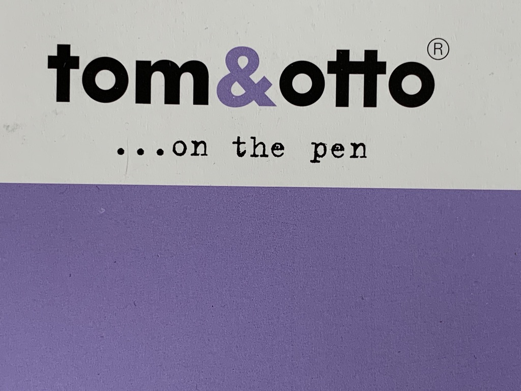
Tom & Otto is a pan-European brand of paper. It is safe, solid, middle of the road… paper. We needed to produce marketing and advertising campaigns that were fun and easy to translate into several languages, plus annual give-aways… from plates to radios to pens… Where to start, with nothing in particular to distinguish it.
What we did
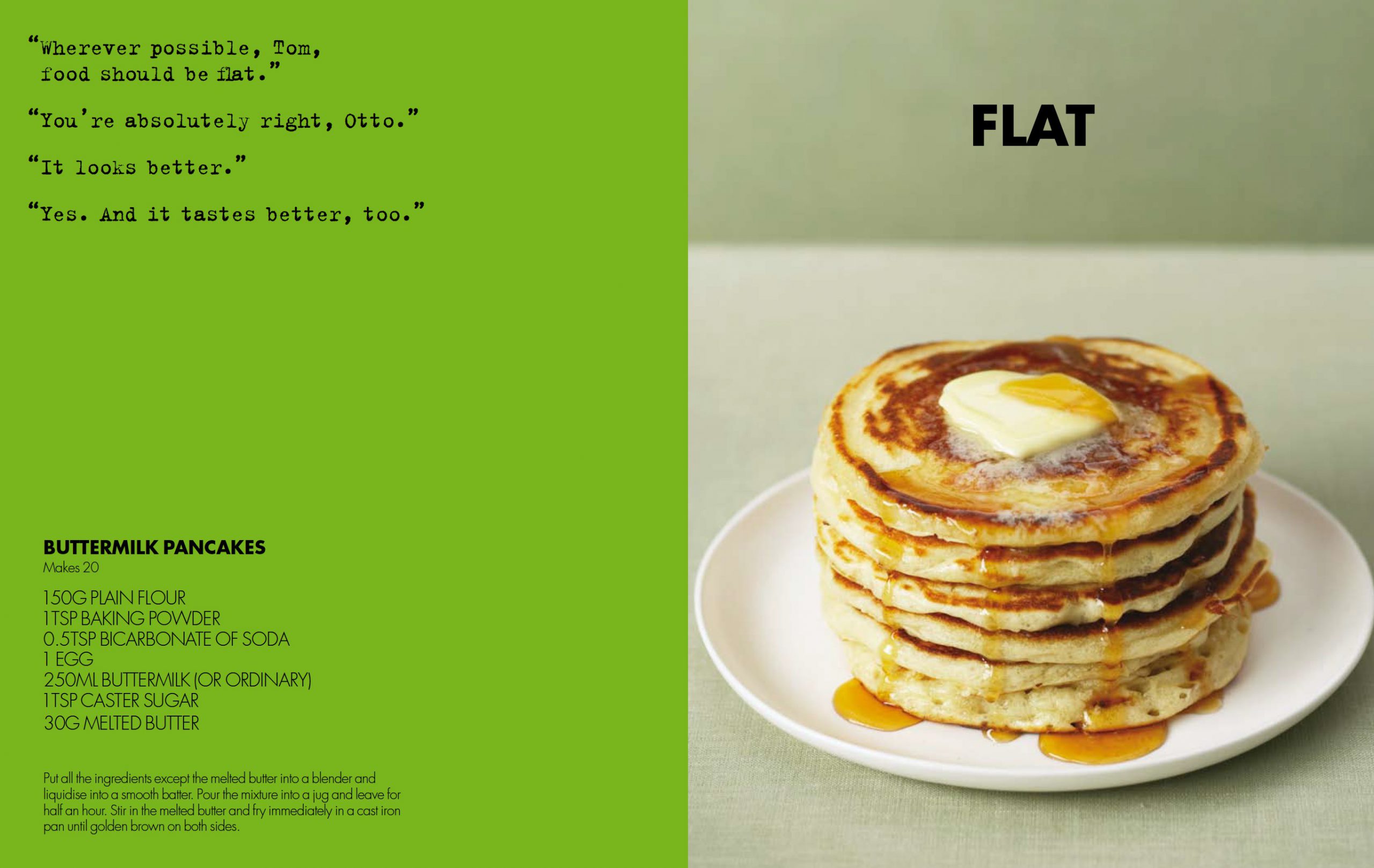
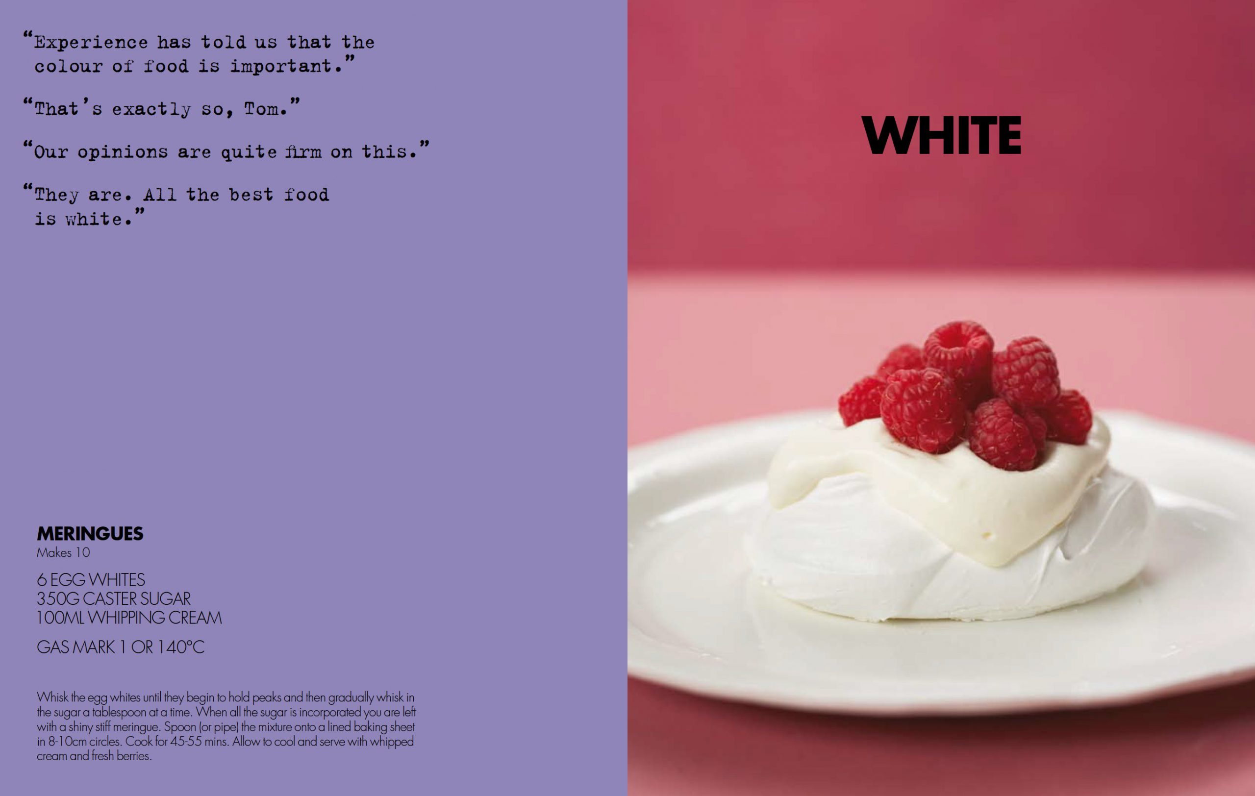
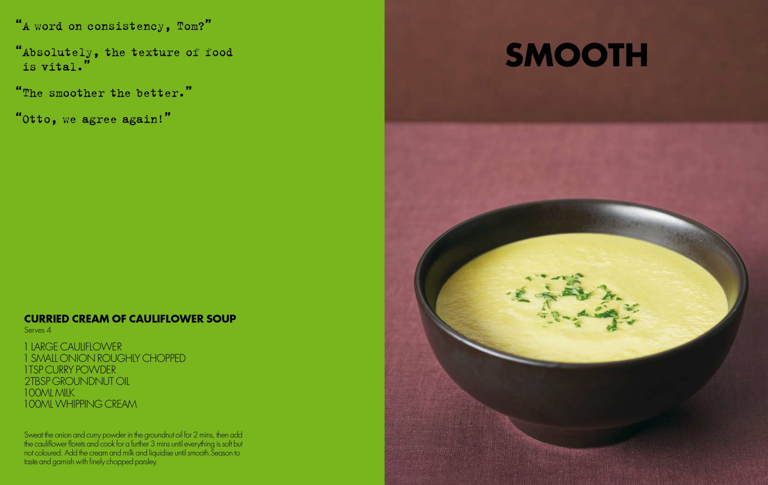
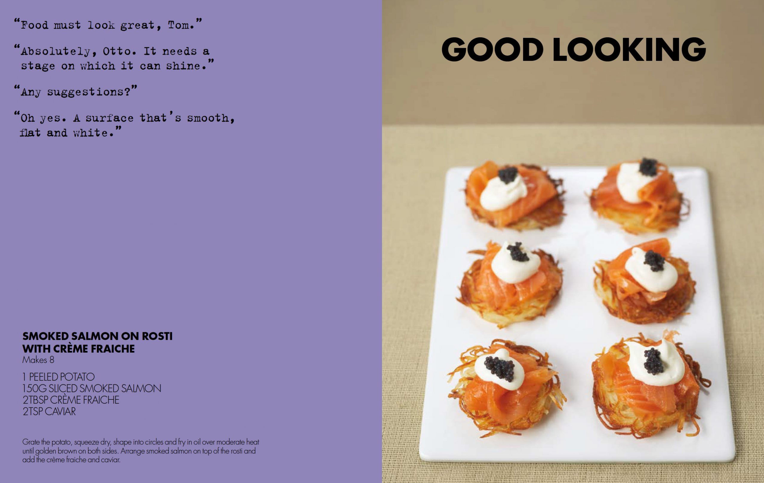
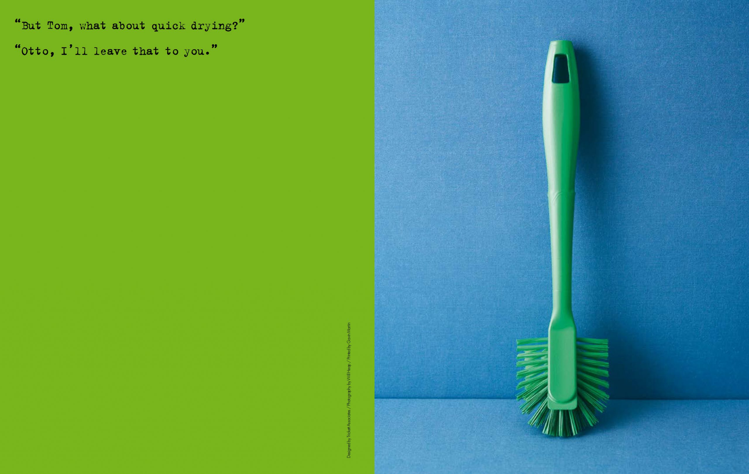
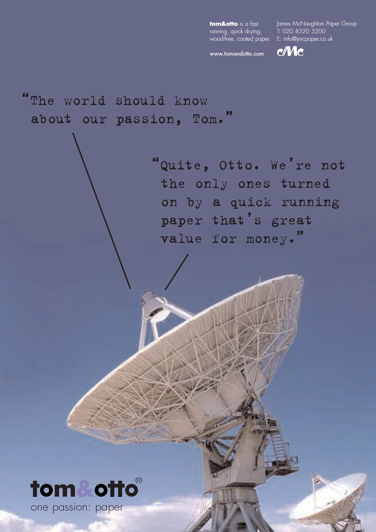
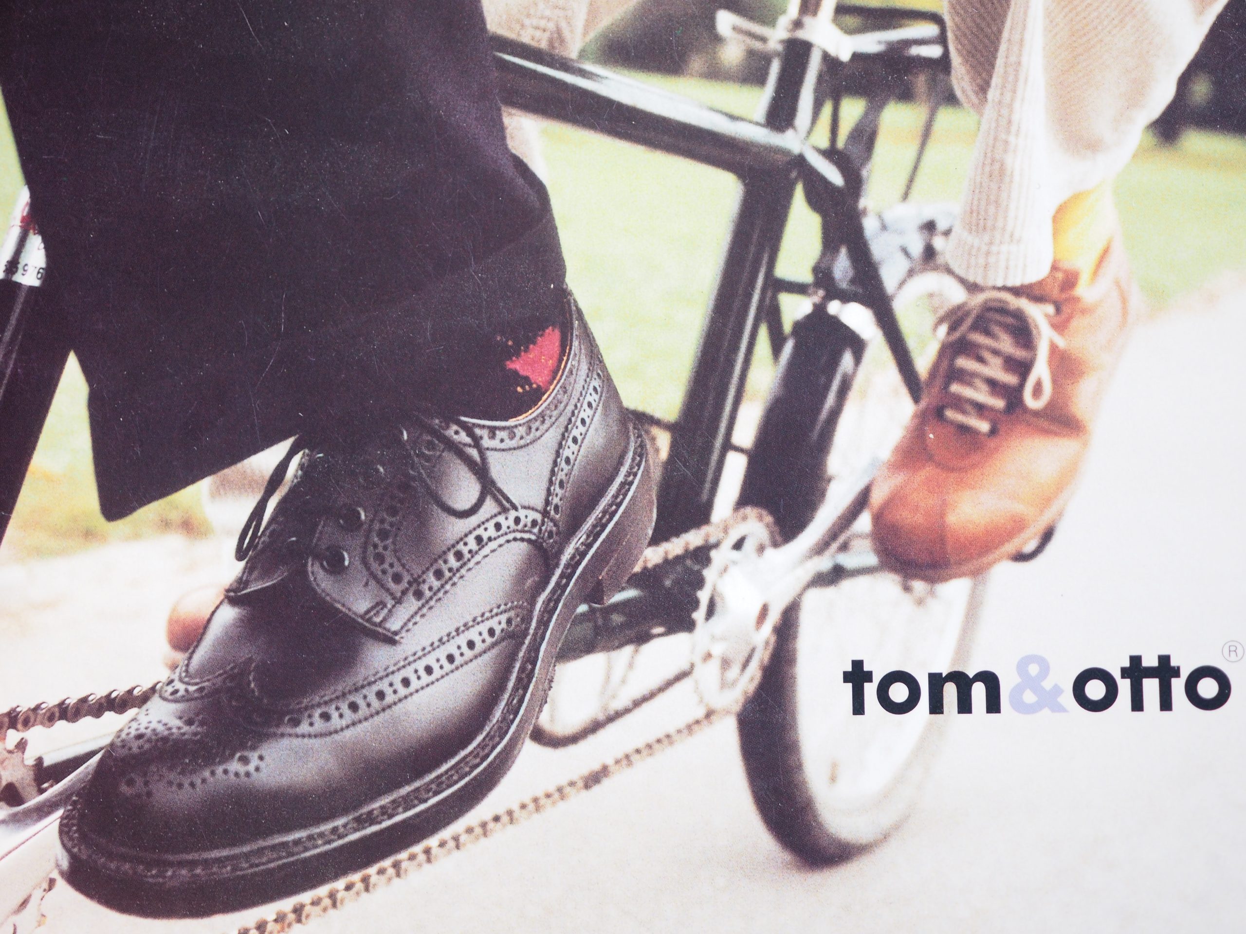
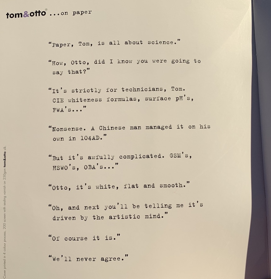
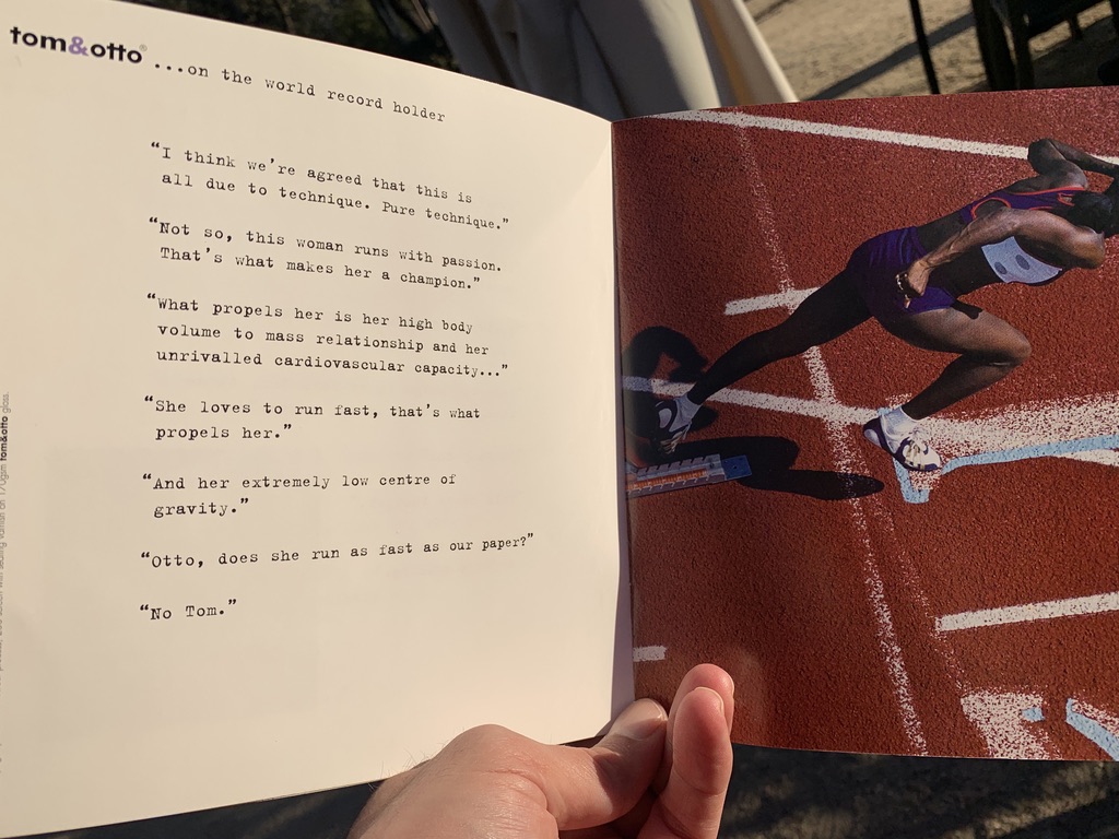
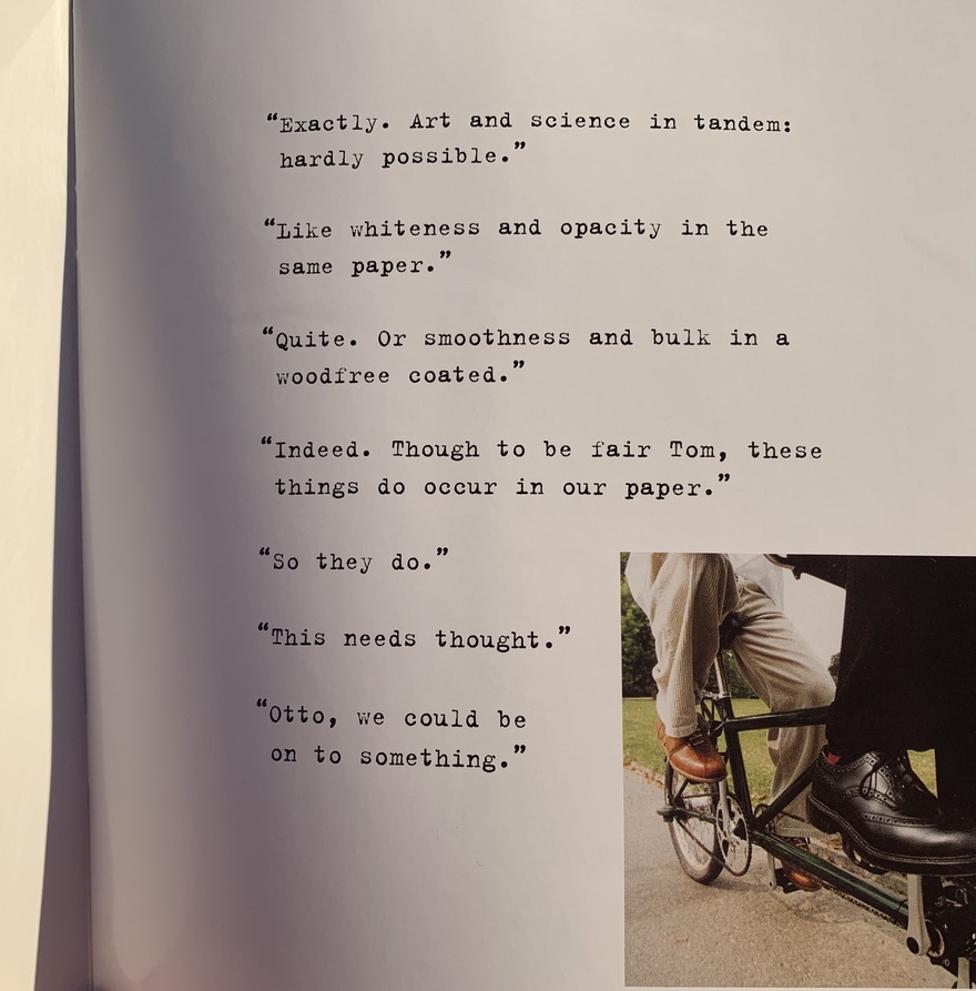
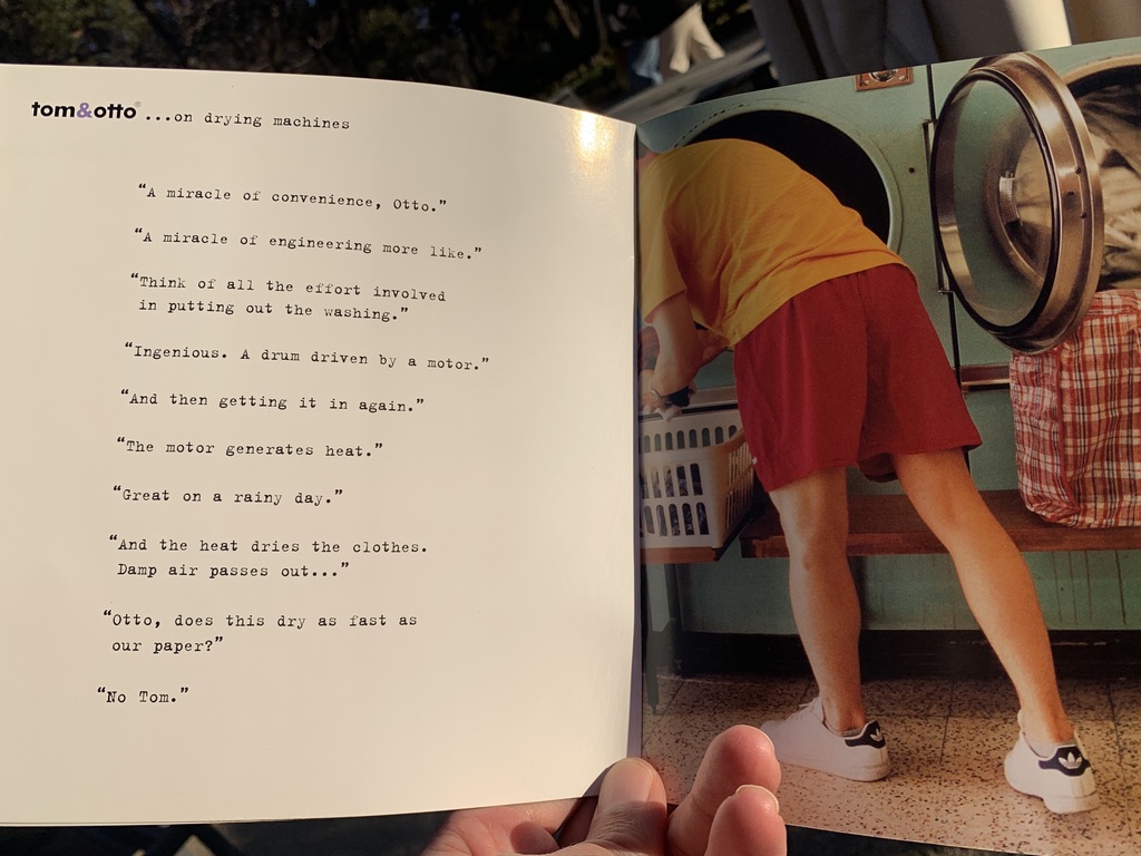
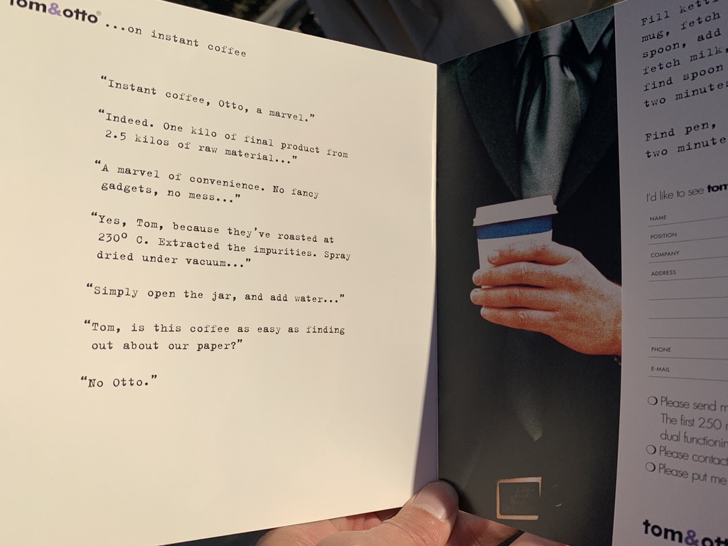
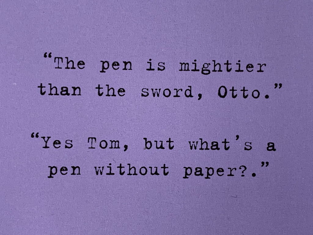
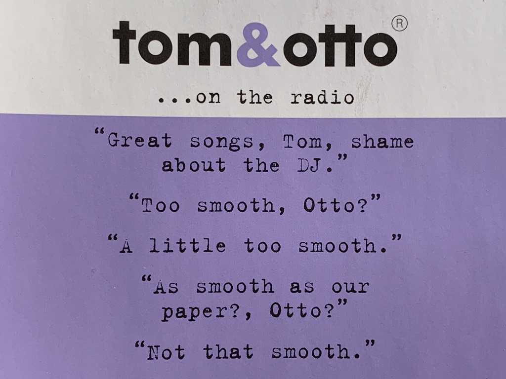
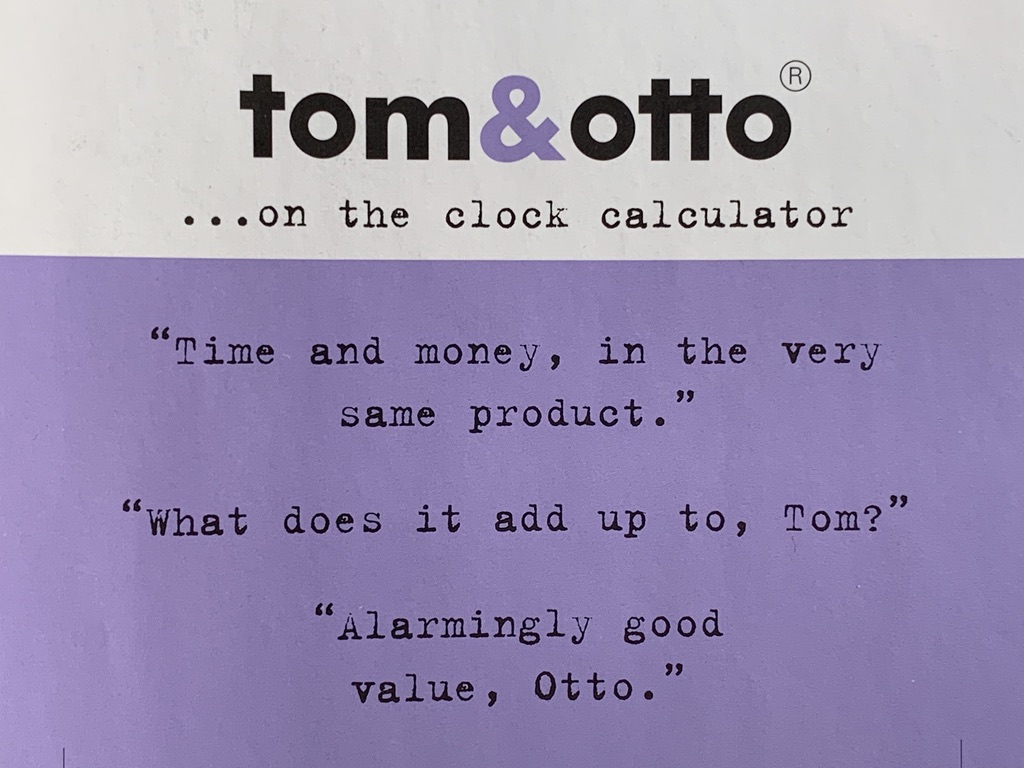
Create two characters who were obsessed with paper and liked anything that expressed the qualities of their paper: flat, white, quick running and good value. Everything was done through dialogue. At the outset they were argumentative: one was more scientific and one more arty… but as time went on and we refined it, they mellowed, and the blind love for paper took over everything. The strapline “Tom&Otto. One passion: paper” tied it all together.
What happened next
This is a relationship that lasted a number of years, beginning in collaboration with Trickett and Webb, and then with Together Design. It only ended when Tom and Otto were bought out… such a shame, it was great fun. That branding could help distinguish a middle-of-the-road product (Sorry Tom, sorry Otto) in such a way that made it a valuable acquisition target is testament to its power. They’re still going. And, though not brilliantly executed, the line “Tom & Otto. One passion: paper” survives with it, as do the initial brand logo fonts and colours. That started around 2002. Think about that when you think about price and value for money.

