The challenge
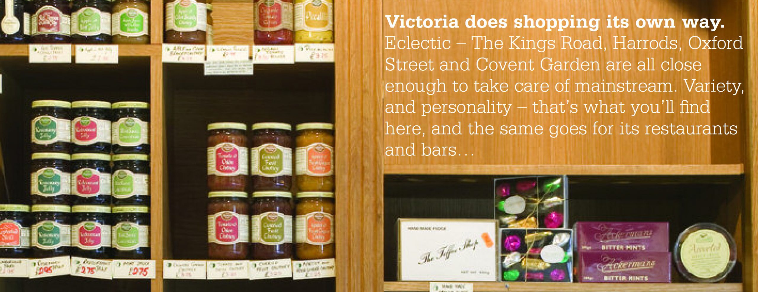
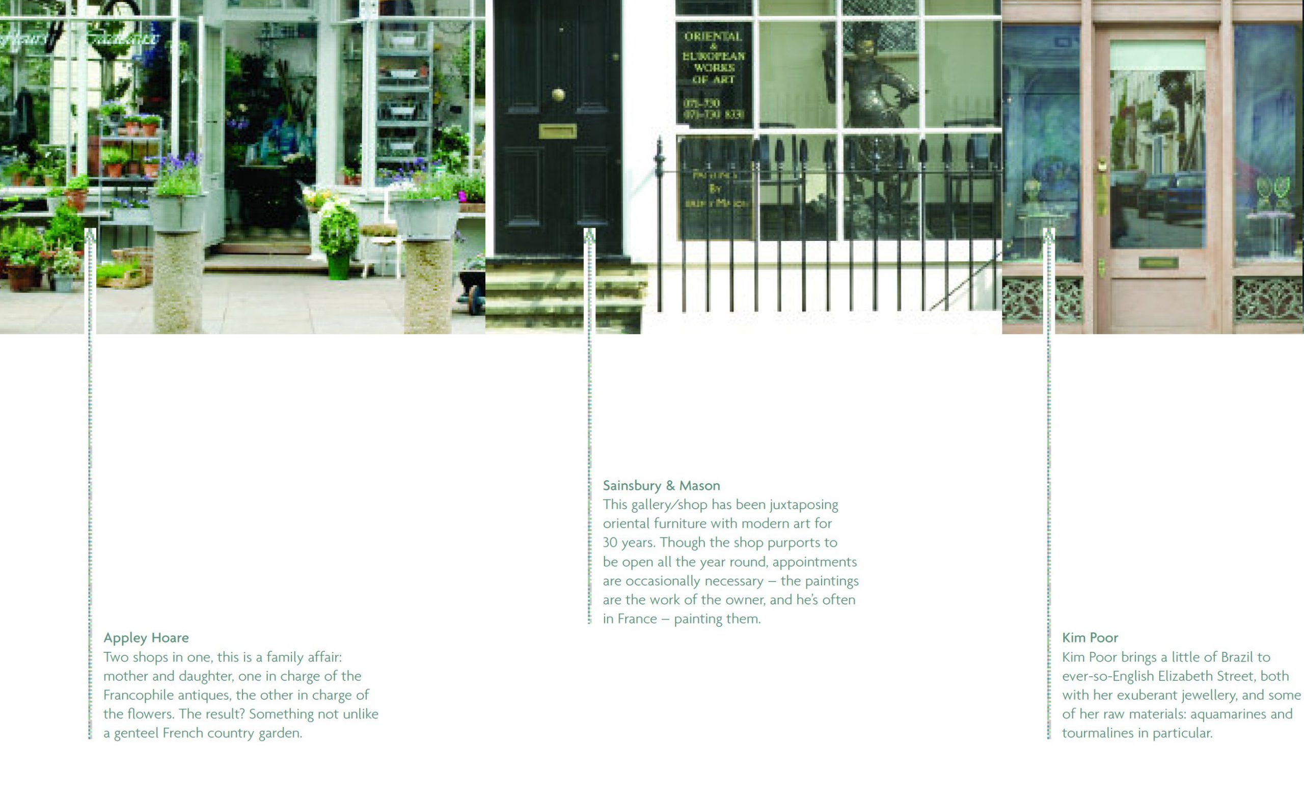
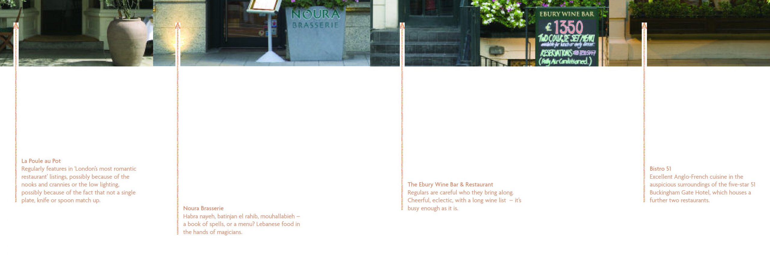
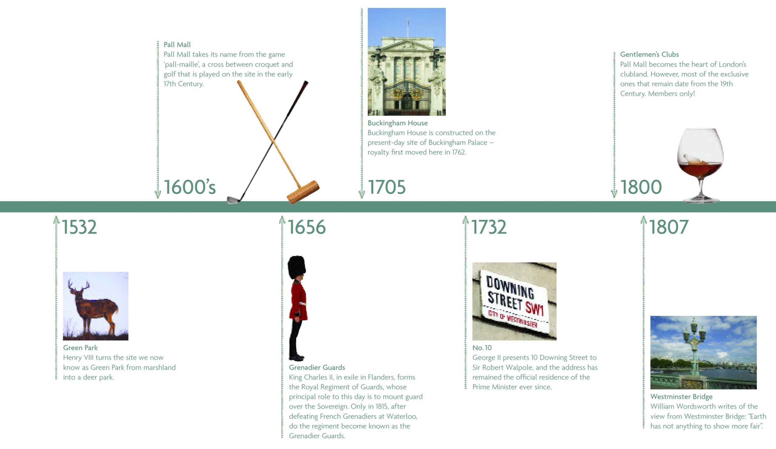
I’ve chosen one small paragraph for one single shop in Victoria as the thumbnail to represent the sales brochures for this newly refurbished Land Securities building in Victoria, because it sums up the entire Land Securities / Hat-trick Design approach to marketing in this sector, which ended up being quite an overhaul. We didn’t just sell a building. We chased down everything of interest. We close-on branded Victoria, right down to tiny details like the type of clothes in this shop.
What we did
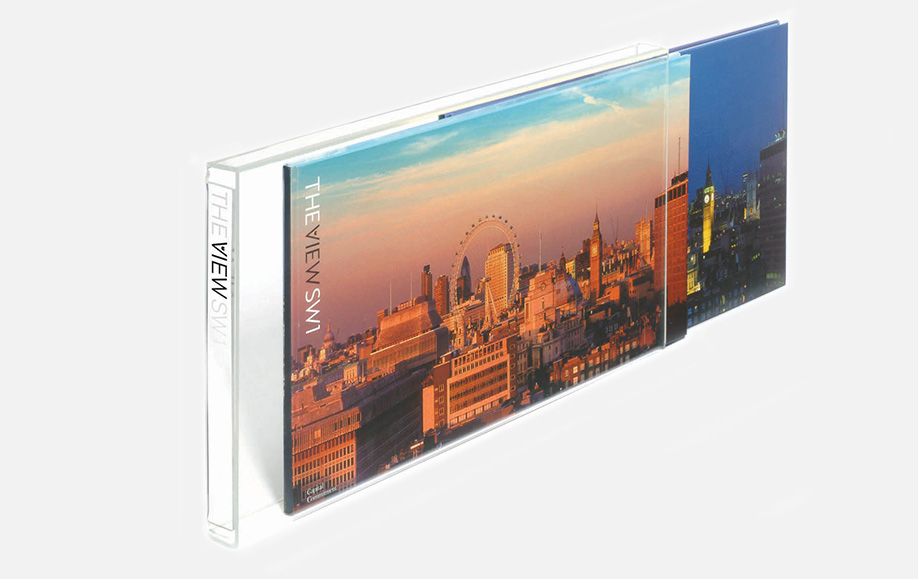
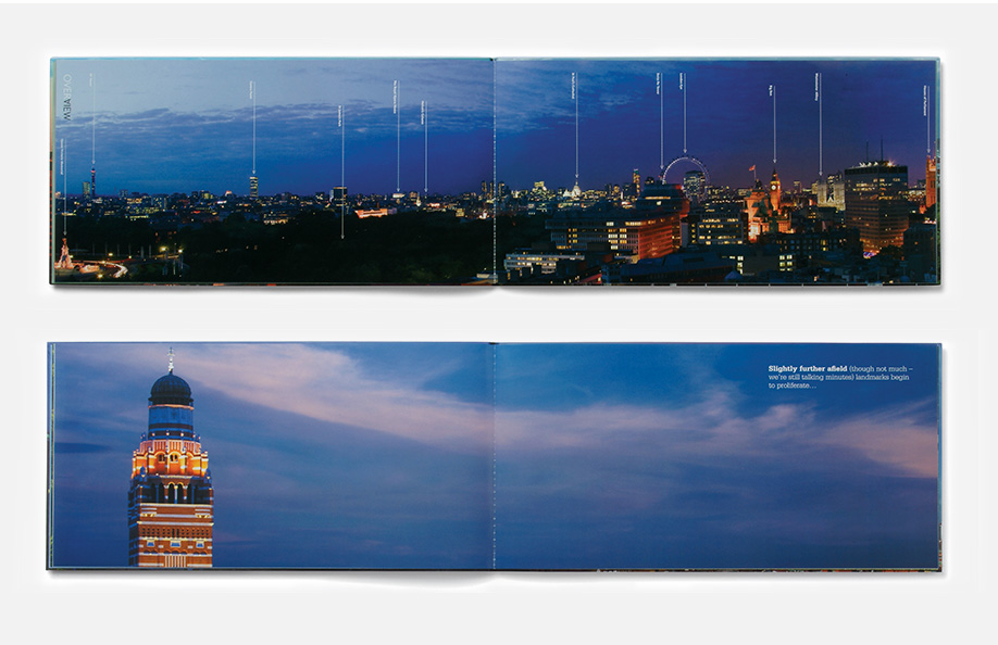
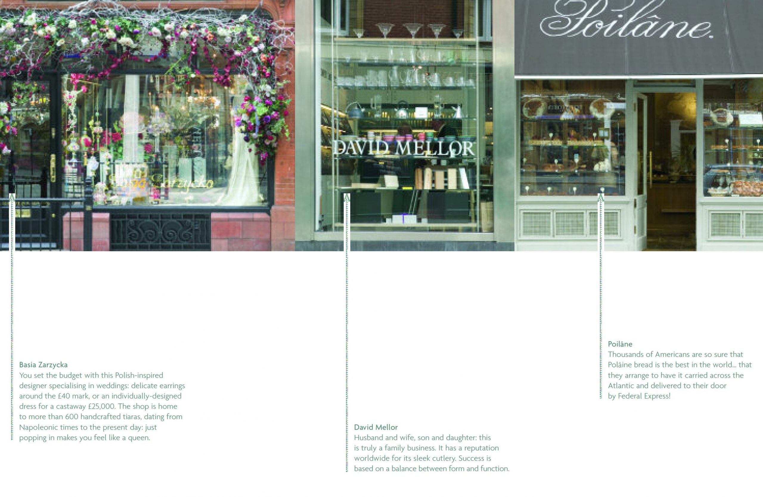
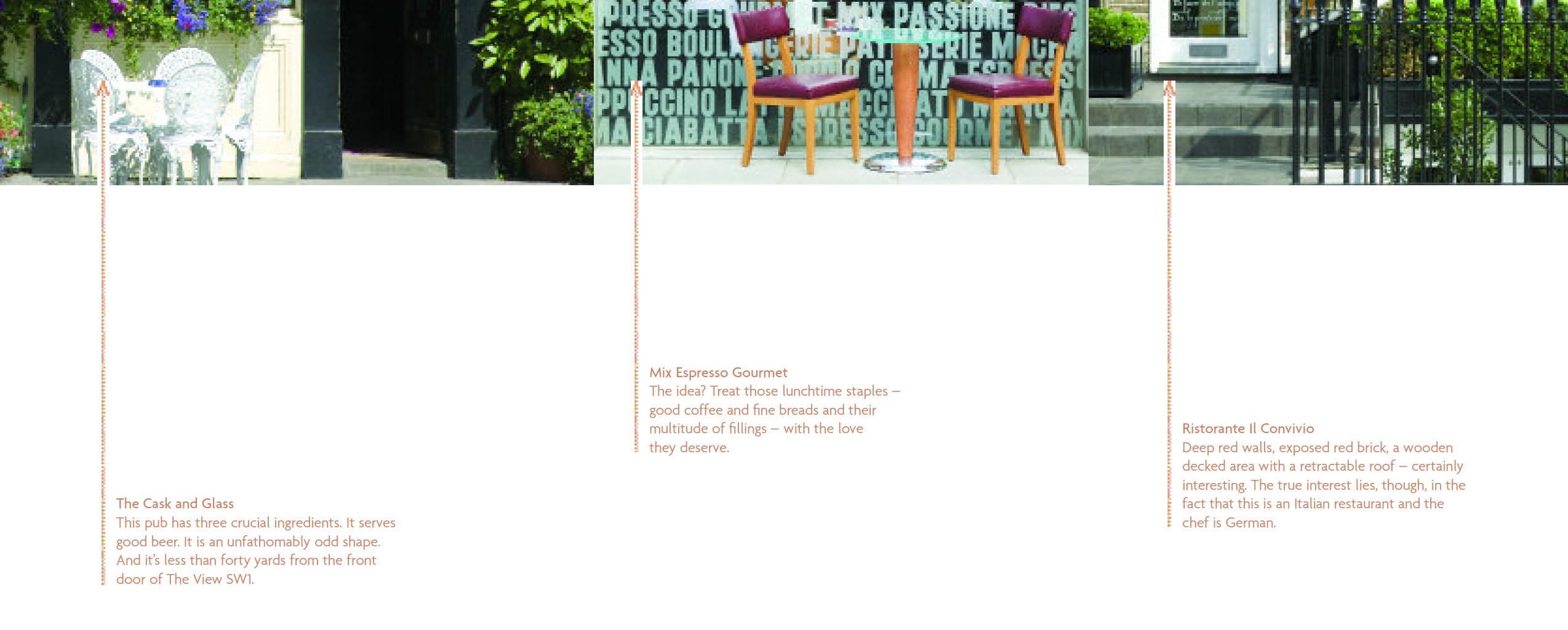
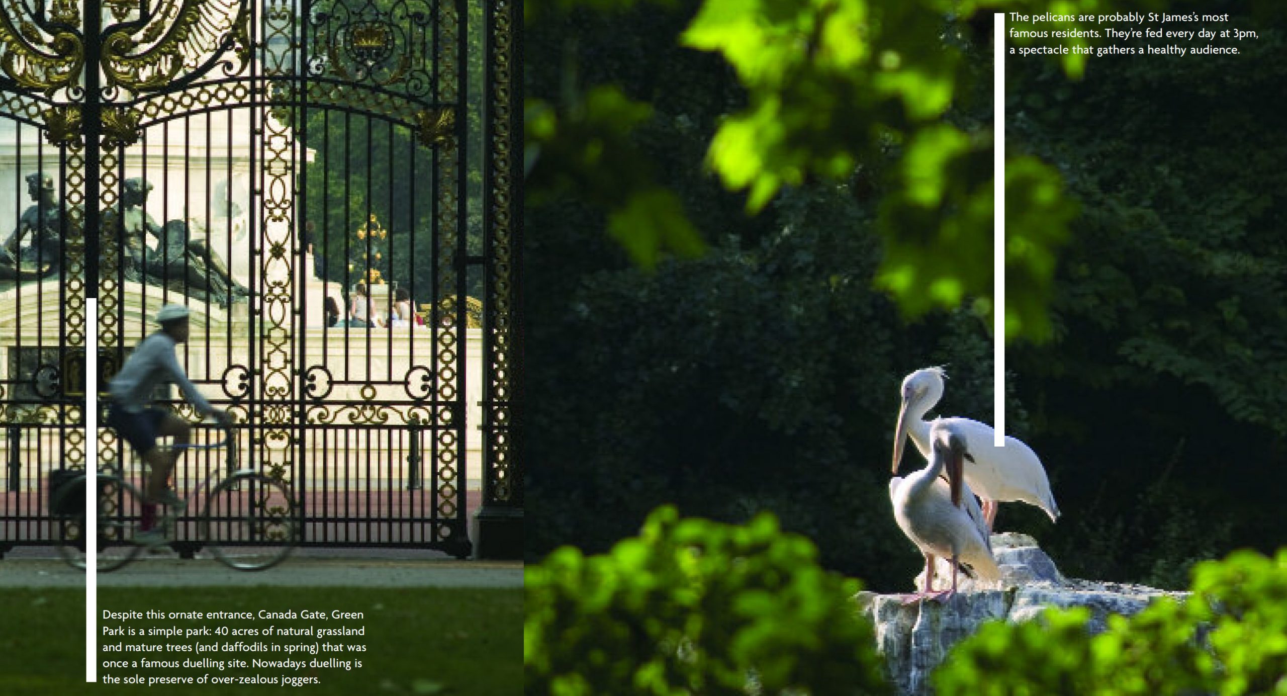
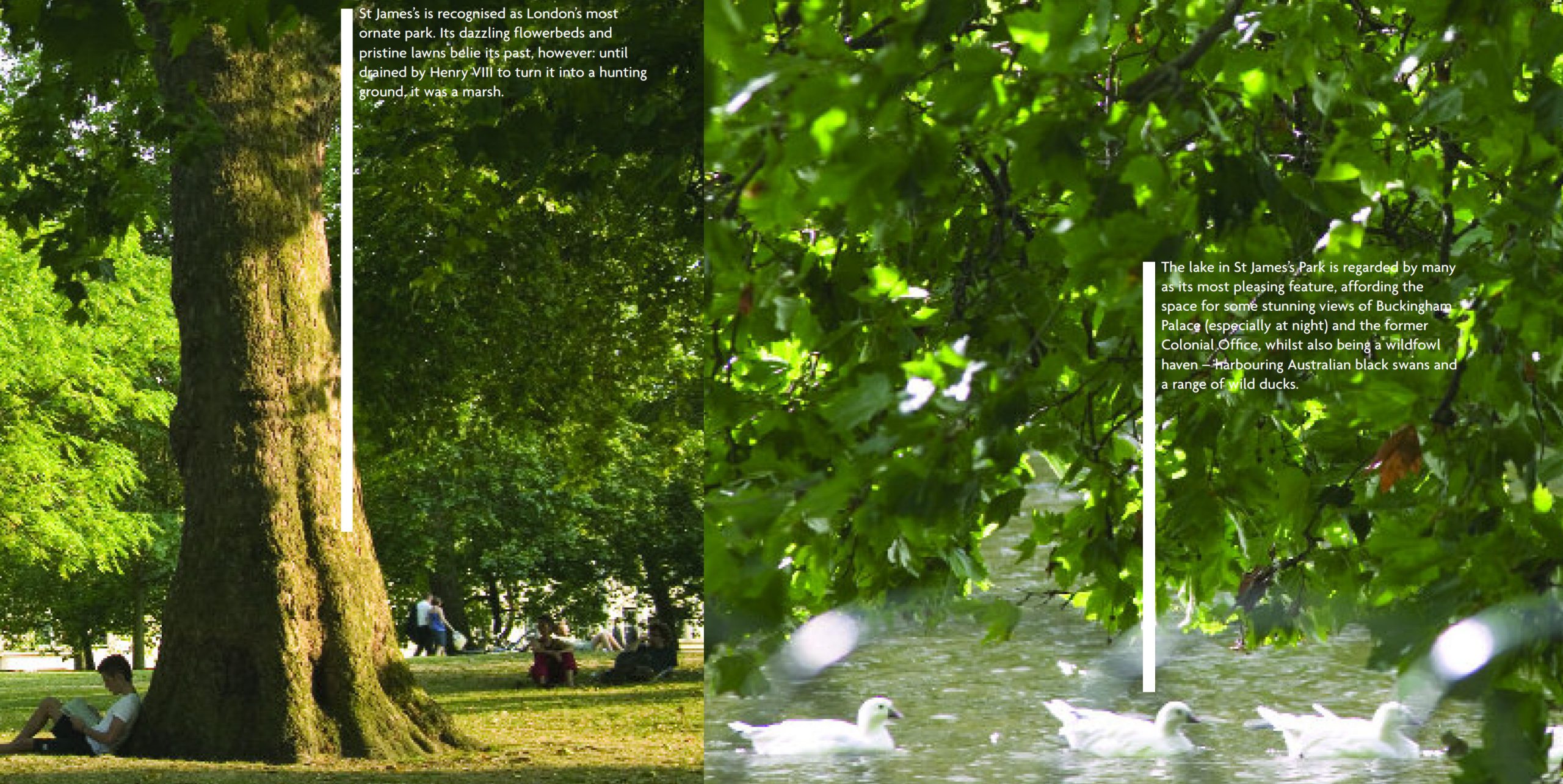
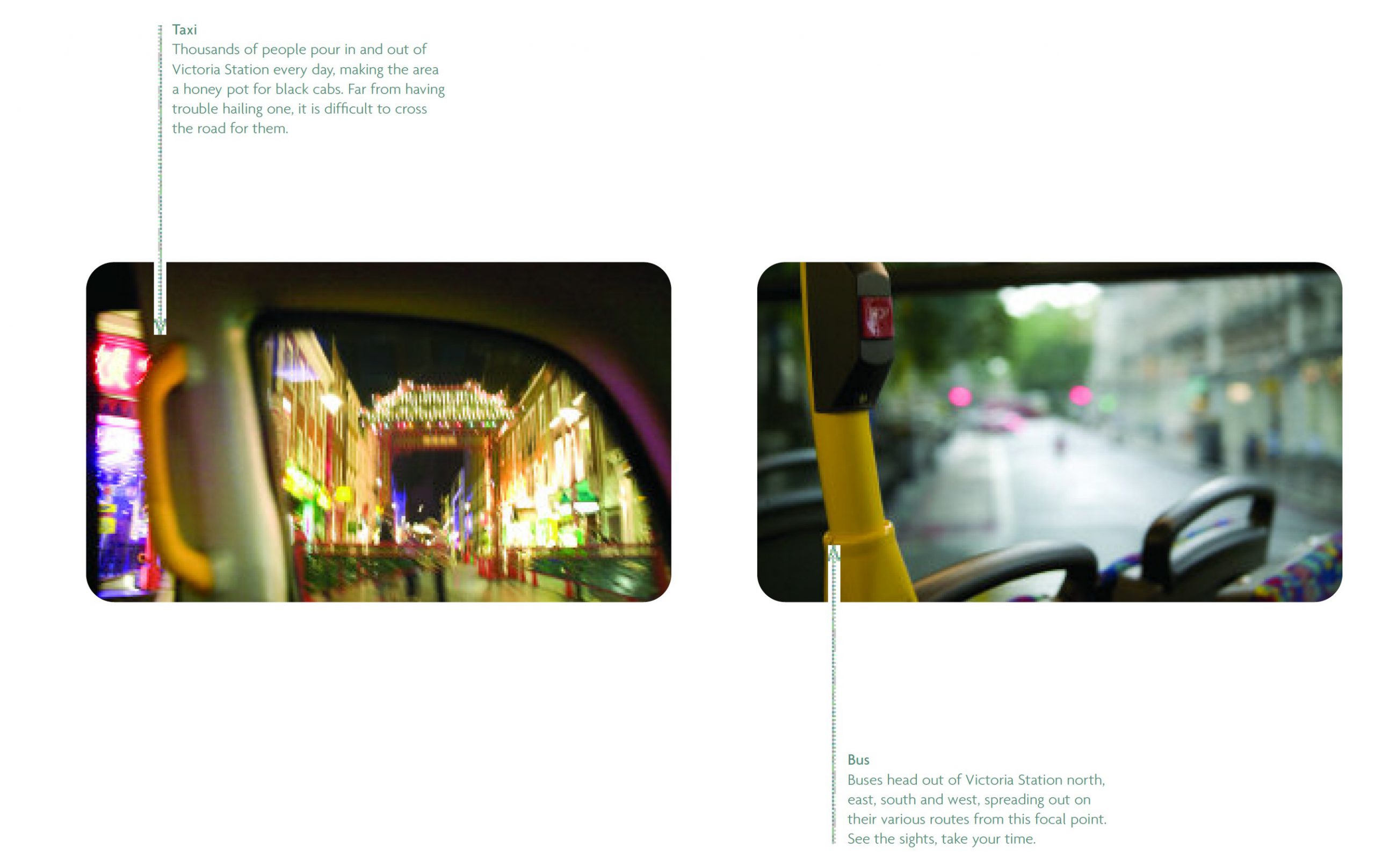
The View was the name given to the building, for obvious reasons, with the brand built around the old-fashioned tourists’ viewfinder. We produced two looooong landscape books to showcase the broooooad horizons, one on the building, one on the area, slotted neatly into perspex cases that felt like windows. We packed as much charm into every small observation and detail as possible.
What happened next
All of our projects for Land Securities sold, and I think it was because the Land Sec leadership at the time were willing to invest in making each communication both creative and special. Both form and content. No one else was doing anything remotely similar, and it communicated very clearly that they cared. People like landlords who care.
